
Monday, 24 April 2017
EVALUATION
This brief was very good practice heading towards COP3, developing my skills and effective approaches to the documentation and communication of analytical, critical and reflective responses to source material. Understanding how to remain coherent in my argument and answering the question through thorough research. I feel more prepared to tackle COP3. As a question I initially was not even contemplating studio brief 02 but just finding a question of genuine interest to me. I believe the question I chose holds massive importance to the when and how graphic design is dominated by this consumerist culture today. Through research I have broadened my knowledge and have a deeper understand of the concept and history behind graphic design. Using my logic and research to effectively analyse primary and secondary resources to further support my argument as not just a theory but factual evidence to concrete my answer.
In terms of the visual response I believe I have chosen a very well suited response as it ties in perfectly with my essay question. "What’s interesting about this is the irony of how political propaganda was so integral to the progression of graphic design, however today it has little to no importance with graphic design as a practice. This is an issue I shall be tackling in my visual research for Studio Brief 02." Understanding a distinctive problem in our culture today, as you can see this relates perfectly to my essay. So actually trying to solve a problem and reimagine a social media design concept was both enjoyable and challenging, as their are rules and implications involved.
Overall I enjoyed this module as it has broadened my knowledge and enhanced my skills not just as a designer but writing skills as well.
Sunday, 23 April 2017
IT'S NICE THAT: MORAL OBLIGATIONS OF A GRAPHIC DESIGNER

To a doctor, ethics are about keeping a patient alive. The modern Hippocratic oath that a doctor takes is the main example of this. A doctor must swear to "use treatments for the benefit of the ill in accordance with my ability and my judgement.” To a lawyer, the issue of ethics also relates primarily to treating clients well; although this is about ensuring that no conflicts of interest occur and that a lawyer keeps confidential any potentially damaging information they are told by a client. To a designer, at least a designer today, ethical issues are viewed as coming from the client. Rather than framing ethical questions in terms of how the designers themselves might behave professionally, designers frame these questions not around their own practice but around those of the client. What does the client do? Is this ethically acceptable or not? Indeed, is this politically acceptable or not?
This wasn’t always the case, and it is worth casting our minds back to work out why. The designer Milton Glaser presented a talk called Ten Things I have Learnedin London in 2001. In the text of this presentation Glaser says that when he began work in the 1950s he was interested in as being as professional as possible. By keeping his clients at arms length and doing a job for them, but then he says he made a realisation. Graphic design was intrinsically unprofessional. “What is required in our field, more than anything else, is continuous transgression. Professionalism does not allow for that because transgression has to encompass the possibility of failure,” he said.
Glaser’s argument is that graphic designers are engaged in risk and this is an unprofessional position. Designers can give something their best shot but they can’t guarantee their ideas will work, so they are in an unethical position to start off with when it comes to the client. It’s an important intellectual step that was made by Glaser and other designers of his generation. Glaser and his contemporaries began their careers in New York in the 1950s wanting to do the right thing by their hard-working immigrant parents and be professional themselves. However, of significance is that in the 1960s they came in to touch with the potentially conflicting values of personal freedom and social responsibility.
The ethical framework that we operate in today was defined at this time, so it’s worth considering it a little further. Herb Lubalin was an expert at applying typography in a sculptural way and a genius at employing heavily stylized typography to evoke a philosophy or a way of seeing the world. In Unit Editions’ monograph on him the publisher Adrian Shaughnessy describes why Lubalin quit as a partner in a successful agency to set up a design studio: “He didn’t like the idea of selling things to people they didn’t need. But he also did it for creative reasons because he couldn’t do what he wanted to.”
Lubalin did some of his best work for the anti-Vietnam war Democrat George McGovern. He was also nearly arrested for indecency for his work as art director on the erotic review Eros, although he escaped prosecution largely because the publisher Ralph Ginzburg fought the legal case personally. Lubalin’s contribution was a quieter one, creating layouts on interacial sexual relationships which at the time caused great controversy but which today seem innocent and tender. What Lubalin did is find a space around politics and high-end pornography where he could explore graphic design as a creative endeavor.

Brody though believes one of the reasons why political material is so attractive to graphic designers is because it offers them an opportunity to be open and expressive. The best designers today, Brody believes, are “conscious of issues reflecting the rest of the world, and aware of their role within that. They initiate information, inspire and create awareness. Their work is lively, fantastic, bold.” But this entire argument is surely questionable. Are designers making political statements simply because they allow a certain degree of creative freedom? Doesn’t that devalue what they are saying? Isn’t design school in danger of becoming a place in which one passes around slogans? If as Brody suggests aesthetics are less important, does it mean we simply judge design work on the quality of its sloganeering?


COP 3 RESEARCH
Your ISSUU presentation must include the following:
- 250 word introductory statement/rationale
- 5 relevant/related subjects
- 5 relevant quotes
- 5 relevant books
- 5 relevant websites
- 5 relevant images
- 5 relevant contextual references
Your proposal should focus on the development of a body of theoretical, contextual and practical research around an individually appropriate theme or subject relating to your selected question.
Potential Questions:
Question 6: To what extent has Graphic Design constructed our understanding or view of historical events and perceptions of truth?
Question 4: To what extent do Technological developments in production and distribution impact on Graphic Design?
Question 1: What is Good? - To what extent does Social Responsibility impact on the role and function of Graphic Design?
Chosen Question:
Question 6: To what extent has Graphic Design constructed our understanding or view of historical events and perceptions of truth?
I have selected this question mainly due to the feedback I received from the essay I am writing for COP 2. They are similar in purpose. My question for it was: "How the actions of World War Two lead to a change in the style, purpose and intent of what consists in Graphic Design today?" My feedback from this essay so far is that for such a broad topic the essay would need to be bigger to fully discuss and argue my point across. Thus deciding that perhaps now I could delve further into the question with greater depth, as this subject is still very interesting to me and seeing how I have already gained some knowledgable information from COP2, it will only enhance my final COP3 essay. I can refer back to the use of Graphic Design in WW2 as an example to use for the question, along with other suitable points. What's so interesting about this question is how inadvertently Graphic Design achieved shaping our understanding and perceptions of truth. People do not realise the power it so unanimously holds over the world, because it is so abundant and fabricated into everyday life. There are two projects which have helped me realise this over second year, as I myself have unknowingly created a piece of graphic design that constructs an understanding of an historical event. Overall this question is of huge interest to me, as well as relevancy to my learnings so far at university and I look forward to greatening my understanding on this chosen topic. I believe that understand the who, what, why and when of Graphic Design and it's history will ultimately make me a better designer.
Relevant related subjects:
- WW2
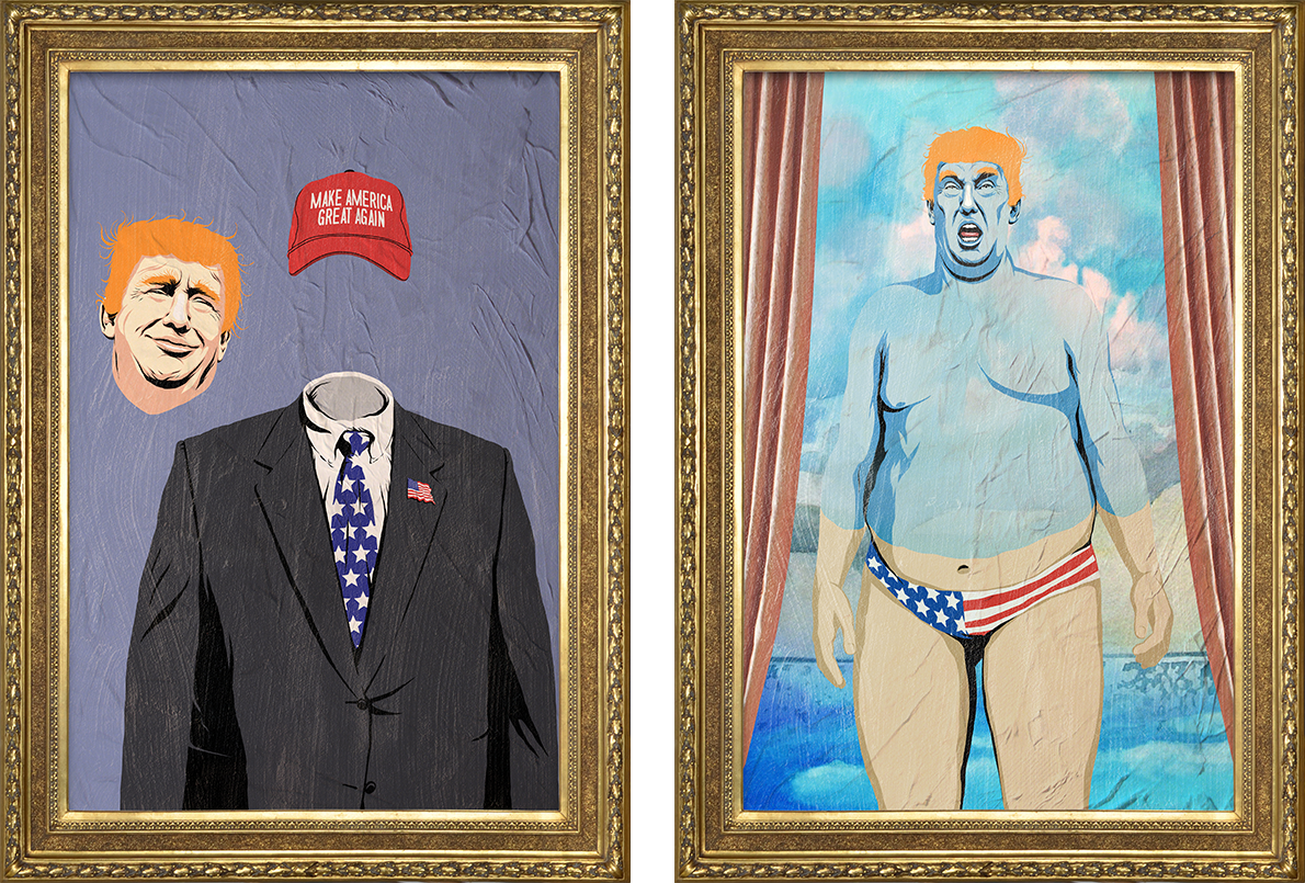
- Trump Presidency
- Brexit
- Social Media
- Products
- Food & Health
Quotes:
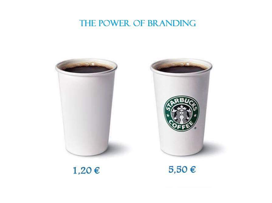
" A brand is a living entity and it is enriched or undermined cumulatively over time, the product of a thousand small gestures" Michael Eisner
" turning potentially negative situations into positive ones was one of the biggest opportunities social media offered SMS" Kaylene Moore
"I am no fan of President Obama, but to show you how dishonest the phony Washington Post is, they wrote, " Donald Trump suggests President Obama was involved with Orlando shooting" as their headline. Sad!" Donald Trump
Social marketing: “seeks to develop and integrate marketing concepts with other approaches to influence behaviours that benefit individuals and communities for the greater social good” International Social Marketing Association
“It is not the consciousness of men that determines their existence, but, on the contrary, their social existence that determines their consciousness” Karl Marx
" The man who stops advertising to save money is like the man who stops the clock to save time" Thomas Jefferson
Books:
Do Good Design: How Designers Can Change The World – David Berman
Communication Theories: Origins, Methods and Uses in the Mass Media (5th Edition)
100 Ideas that Changed Graphic Design
Graphic Design in Germany 1890-1945 - Jeremy Ainsley
Why the UK Voted for Brexit - David Cameron
Global Brand Power: Leveraging Branding for Long-Term Growth - Barbara e. Kahn
Websites:
http://vanseodesign.com/web-design/design-history/
http://fusion.net/thank-goodness-trumps-tweets-now-come-with-a-fact-chec-1793864298
Images:


Contextual References:
http://fusion.net/thank-goodness-trumps-tweets-now-come-with-a-fact-chec-1793864298
Swatthzika as a brand
http://www.kansascity.com/news/local/news-columns-blogs/the-buzz/article55604110.html

COP BRIEF
Brief:
Using U.S as an example, there are 75 million millennials citizens (18-29yrs) however in the 2016 election only 24 million voted. This demographic still holds the highest percentage for usage of social media. What this tells us is majority of millennial do not have a very active interest in politics. Online content from sites such as Vice are where millennials get their news from, but the information gained is limited, as the audience tends to be more drawn to content more relevant to their youth culture such as; fashion, arts, music etc.
Produce an engaging visual investigation for Vice magazine that re-evaluates how an audience engages with news content on social media, by creating public awareness on a political matter, that can educate the world. Using the commercial/social media culture of graphic design to the advantage of spreading a meaningful form of communication that be put towards a worthwhile use.
TARGET AUDIENCE

A prevailing notion in marketing in general is that millennials are the most valuable demographic to reach, seeing as my visual will be intended for an audience of 18-29 it was important that motives behind the design are to educate and create awareness on a specific matter, in a format that works best for the intended audience. A marketing persona is a composite sketch of a key segment of your audience. For content marketing purposes, you need personas to help you deliver content that will be most relevant and useful to your audience
Young people aged 18-29 are the least likely to watch network news regularly (only 11 percent did so in 2012), and 49 percent of people in this age group say they never watch the news.
“We label ourselves as a youth media company,” Dan’l Hewitt, general manager of the Vice Media owned AdVICE network tells TheMediaBriefing. “Over 80 percent of our global audience is 18-34.”
Generally, females use social networking sites to make connections and stay in touch with family or friends.
Men, by contrast, use social media to gather the information they need to build influence. Social media helps them perform research, gather relevant contacts and ultimately increase their status.
Although there wasn’t a targeted gender for this brief as the concept is still for the general demograph of 18-29 some aspects were taken into consideration that majority would more likely be a male audience.

CONTEXTUAL RESEARCH - THE ECONOMIST
 Neville Brody:
The best designers today, Brody believes, are “conscious of issues reflecting the rest of the world, and aware of their role within that. They initiate information, inspire and create awareness. Their work is lively, fantastic, bold.”
This would be the ethos behind my visual investigation.
According to The Economist’s About us page (About us):
Rupert Pennant-Rea on The Economist: “a Friday viewspaper, where the readers, with higher than average incomes, better than average minds but with less than average time, can test their opinions against ours. We try to tell the world about the world, to persuade the expert and reach the amateur, with an injection of opinion and argument.”


DESIGNS FOR VISUAL INVESTIGATION

After deciding in feedback that this was the most liked design, I just carried on experimenting with the same design perhaps tweaking the type and positioning, and effects applied. Here I changed the type by applying paint strokes. Implying the chaos of the statement. Also adding brand placement at the bottom. On a phone or computer it works to also add different ways of connecting. The footer at the bottom works as an extention to online content of the brand.
- So you can click join the conversation to join
- click @VICE to go to their profile
- Click on the info to go to their about section
I also think the grey footer provides visual harmony to the high contrast of the blue and red.


Here I was experimenting with a change in colour and a different paint stroke effect on the typeface. Trying different colour schemes to see which would provide the most visually striking design.

I chose this as the final design because your first idea is sometimes the best. I did not like over complicating the idea with different paint stroked effects. I think for the message I am trying to convey this design works best. The constrast of colours enforces the message. It also conveys America through it’s selection of colour, with the red, white and blue. The size of the type works well to obtain audiences attention and give a direct message. Trigger words were important, the less type the better, as the design is merely working to convince the reader to read on. As a design it would work on cross platforms not just as a design for social media but a number of mediums. It can work universally whilst promoting the message to the audience in a clear concise manner.
NIGEL FARAGE CONCEPT

This was the first design idea, focusing on the idea of being relevant to pop culture, as this is also a way of connecting with the target audience. Through a context away from the politics, the first objective is to gain attention. Seeing as the Simpson’s finally announced their final season, I believed it could provide a relevancy to the subject.
At this point I had not chosen the subject of what politics I was going to include so ideas were just experimented with.
Here I am trying to relate idiocy of Nigel Farage and Barnie a Simpson’s character. I thought it would be a universal way of demonstrating a point of view. A way of making a concrete statement visually.
Feedback was on the fence with the idea, the concept was accepted but from an actual design point of view it lacked in quality.
PRODUCTION/DISTRIBUTION/RECEPTION
SOCIAL MEDIA:
The design’s main purpose was to be interactive with social media sites such as Twitter and Facebook in an animated format to engage the selected audience. Human attention span has decreased to 8 seconds due to the increase in technology, this was important when designing my solution and was the reason to create a motion graphic piece, in a bribe to further engage.
The general aim for this solution was to help engage the audience in a political matter. Through research I have concluded that majority of millenials interest does not really reside with politics my animation works to persuade them to engage with the content, in a style that does not comply to the standardised method of displaying news content via social media.
OTHER TOUCHPOINTS:
Other touchpoints could include website, poster, banner, magazine etc. the design works universally on a number of formats. Physical prints was not the purpose but it was important that the design worked physically to further spread awareness. The design does mainly lie digitally as it is an animation.


CONTEXTUAL RESEARCH - VICE
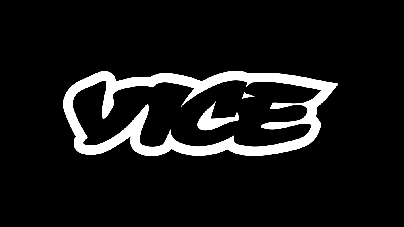 They have the magic recipe for reaching the industry’s most coveted and most elusive demographic: Millennials.. Which is why this brief’s idea was very well suited towards their ideology as a company.
Media sites such as Vice and Buzzfeed helped me understand how to obtain their audience. Being relevant in culture such as appealing to fashion, art and sports supports this. Humour also has an important element to the concept.
The common characteristic all these outlets is their vast array of communications. Social Media, art, magazines, posters and other sources of online content. My visual would also have to be suitable for many mediums.These are all in direct reference to Studio brief 01 as it enforces the social marketing concepts defined in the essay, and other aspects such as mass production as well as the importance of propaganda in the practice of graphic design.
In studio brief 01 a lot was discussed in regard to the commercialism of graphic design, and the methods of how a product creates interest through graphic design. The same way Hitler made a corporate identity for the Nazis. My idea was to bring these branding concepts to the way news is presented. In social media a consistant template is used, every news outlet follows it, the sharing of video/image but branding techniques are not apparent. There isn’t a method of engaging interest unless your audience already has an interest in the subject. I wanted to create a new template that provides engagement and visual identity. The same way competitors such as The Economist distribute humourous images with their content to create interest.
DEFINING THE BRIEF
Potential research questions:
How advertising corrupted society through branding altering the way we perceive consumer purchase?
How branding has encouraged materialistic values in todays society
How the search for contemporary altered the visual atheistic of current graphic design?
How is the practice of Graphic Design instrumental to the construct of propaganda?
‘The advertising industry corrupted society,’ said Benetton creative director Oliviero Toscani. His response has been a series of notorious campaigns about race, birth control, Bosnia and so on that are supposed to shock consumers out of complacency – and into what exactly? This invasion of our consciousness is in no sense a dialogue: the messages flow in one direction only, from manufacturer to consumer, and the purpose is still to make you buy jumpers.
How the search for contemporary altered the visual aesthetic of current graphic design?
has altered the current means and future modern design and how this correlates with graphic design
https://www.google.co.uk/search?q=neo+dada&espv=2&biw=1280&bih=604&source=lnms&tbm=isch&sa=X&ved=0ahUKEwiXgbOqpYXQAhVGBsAKHVc5DmwQ_AUIBigB#tbm=isch&q=neo+dada+graphic+design
Subscribe to:
Comments (Atom)